/* =========================================================
   SADKOWSKI LAB — ACADEMIC STYLESHEET (WHITE BACKGROUND)
   Slim header · Sharp section image banners · Clean & modern
   Type: Playfair Display (display) · Lora (body) · Inter (UI)
   ========================================================= */

/* ===== DESIGN TOKENS ===== */
:root {
    /* Brand colors */
    --color-primary:        #1e4d6b;   /* deep teal-navy (scholarly) */
    --color-primary-dark:   #143548;
    --color-primary-light:  #2d6e92;
    --color-accent:         #d97757;   /* warm coral (friendly) */
    --color-accent-dark:    #b85f3f;
    --color-accent-soft:    #fce8df;
    --color-success:        #4a8b6f;
    --color-gold:           #c9a55a;

    /* Neutrals — WHITE BACKGROUND */
    --color-ink:            #1a2332;
    --color-text:           #2d3748;
    --color-text-soft:      #4a5568;
    --color-muted:          #718096;
    --color-border:         #e5e7eb;       /* light neutral border */
    --color-bg:             #ffffff;       /* pure white */
    --color-bg-alt:         #f7f9fc;       /* very subtle light gray */
    --color-surface:        #ffffff;
    --color-dark:           #0f2433;

    /* Typography */
    --font-display: 'Playfair Display', 'Merriweather', Georgia, serif;
    --font-serif:   'Lora', 'Merriweather', Georgia, serif;
    --font-sans:    'Inter', 'Roboto', -apple-system, BlinkMacSystemFont, sans-serif;

    /* Spacing & shape */
    --radius-sm: 6px;
    --radius:    12px;
    --radius-lg: 20px;
    --shadow-xs: 0 1px 2px rgba(30, 77, 107, 0.05);
    --shadow-sm: 0 2px 8px rgba(30, 77, 107, 0.06), 0 1px 3px rgba(30, 77, 107, 0.04);
    --shadow:    0 6px 20px rgba(30, 77, 107, 0.08);
    --shadow-lg: 0 16px 40px rgba(30, 77, 107, 0.12);
    --shadow-warm: 0 8px 24px rgba(217, 119, 87, 0.18);
    --transition: 0.3s cubic-bezier(0.4, 0, 0.2, 1);
    --transition-bounce: 0.4s cubic-bezier(0.34, 1.56, 0.64, 1);

    --container-max: 1280px;
    --header-height: 58px;
}

/* ===== RESET & BASE ===== */
*, *::before, *::after { margin: 0; padding: 0; box-sizing: border-box; }
html { scroll-behavior: smooth; -webkit-text-size-adjust: 100%; }
body {
    font-family: var(--font-serif);
    font-size: 17px;
    line-height: 1.75;
    color: var(--color-text);
    background: #ffffff;            /* WHITE BACKGROUND */
    -webkit-font-smoothing: antialiased;
    -moz-osx-font-smoothing: grayscale;
    text-rendering: optimizeLegibility;
}

h1, h2, h3, h4, h5, h6 {
    font-family: var(--font-display);
    line-height: 1.25;
    color: var(--color-primary);
    font-weight: 700;
    letter-spacing: -0.01em;
}

h1 { font-size: clamp(2rem, 4vw, 3.25rem); }
h2 { font-size: clamp(1.75rem, 3vw, 2.5rem); }
h3 { font-size: 1.4rem; }
p  { margin-bottom: 1rem; }

a {
    color: var(--color-primary-light);
    text-decoration: none;
    transition: color var(--transition);
}
a:hover { color: var(--color-accent-dark); }

img { max-width: 100%; display: block; }

::selection { background: var(--color-accent); color: #fff; }

.container {
    max-width: var(--container-max);
    margin: 0 auto;
    padding: 0 24px;
}

/* Accessibility */
:focus-visible {
    outline: 3px solid var(--color-accent);
    outline-offset: 3px;
    border-radius: var(--radius-sm);
}
@media (prefers-reduced-motion: reduce) {
    *, *::before, *::after {
        animation-duration: 0.01ms !important;
        transition-duration: 0.01ms !important;
        scroll-behavior: auto !important;
    }
}

/* =========================================================
   SLIM HEADER / NAV — WHITE
   ========================================================= */
.header {
    position: fixed;
    top: 0; left: 0; right: 0;
    background: rgba(255, 255, 255, 0.96);
    border-bottom: 1px solid rgba(30, 77, 107, 0.08);
    box-shadow: 0 1px 0 rgba(30, 77, 107, 0.04);
    z-index: 1000;
    backdrop-filter: blur(16px) saturate(180%);
    -webkit-backdrop-filter: blur(16px) saturate(180%);
    transition: all var(--transition);
}

.nav-wrapper {
    display: flex;
    align-items: center;
    justify-content: space-between;
    padding: 8px 0;
    gap: 1.5rem;
    flex-wrap: nowrap;
    min-height: var(--header-height);
}

/* Sadkowski Lab — pinned LEFT */
.site-title {
    font-family: var(--font-display);
    font-size: 2.2rem;
    font-weight: 700;
    color: var(--color-primary);
    letter-spacing: 0.02em;
    white-space: nowrap;
    flex-shrink: 0;
    margin-right: auto;
    position: relative;
    transition: color var(--transition);
}
.site-title::after {
    content: '';
    position: absolute;
    bottom: -3px; left: 0;
    width: 28px; height: 2px;
    background: var(--color-accent);
    border-radius: 2px;
    transition: width var(--transition);
}
.site-title:hover { color: var(--color-primary-dark); }
.site-title:hover::after { width: 50px; }

/* Menu — all items on ONE line, pushed right */
.navbar {
    display: flex;
    gap: 2px;
    flex-wrap: nowrap;
    align-items: center;
}

.nav-link {
    font-family: var(--font-sans);
    color: var(--color-ink);
    font-weight: 500;
    font-size: 0.88rem;
    letter-spacing: 0.02em;
    padding: 7px 13px;
    border-radius: var(--radius-sm);
    transition: all var(--transition);
    white-space: nowrap;
    position: relative;
}
.nav-link::after {
    content: '';
    position: absolute;
    bottom: 2px; left: 50%;
    width: 0; height: 2px;
    background: var(--color-accent);
    transition: all var(--transition);
    transform: translateX(-50%);
}
.nav-link:hover {
    color: var(--color-primary);
    background: rgba(217, 119, 87, 0.06);
}
.nav-link:hover::after,
.nav-link.active::after {
    width: calc(100% - 26px);
}
.nav-link.active {
    color: var(--color-primary);
    font-weight: 600;
}

.menu-toggle {
    display: none;
    background: none;
    border: none;
    font-size: 1.5rem;
    color: var(--color-primary);
    cursor: pointer;
    padding: 4px;
    transition: transform var(--transition);
}
.menu-toggle:hover { transform: scale(1.1); color: var(--color-accent); }

/* Page body offset for slim header */
.page-body { padding-top: 64px; background: #ffffff; }

/* ===== HERO ===== */
.hero {
    position: relative;
    min-height: 100vh;
    display: block;
    overflow: hidden;
}
.hero-bg-img {
    position: absolute;
    top: 0; left: 0;
    width: 100%; height: 100%;
    object-fit: cover;
    z-index: 0;
    transform: scale(1.05);
    animation: heroZoom 20s ease-out forwards;
}
@keyframes heroZoom { to { transform: scale(1); } }

.hero-overlay {
    position: absolute; inset: 0;
    background:
        linear-gradient(90deg, rgba(15, 36, 51, 0.85) 0%, rgba(30, 77, 107, 0.55) 55%, rgba(15, 36, 51, 0.25) 100%),
        radial-gradient(ellipse at bottom, rgba(15, 36, 51, 0.5), transparent 70%);
    z-index: 1;
}

.hero-content {
    position: absolute;
    top: 50%; left: 8%;
    transform: translateY(-50%);
    z-index: 2;
    text-align: left;
    max-width: 660px;
    animation: heroFadeUp 1s ease-out 0.2s both;
}
@keyframes heroFadeUp {
    from { opacity: 0; transform: translateY(-40%); }
    to   { opacity: 1; transform: translateY(-50%); }
}
.hero-content h1 {
    font-family: var(--font-display);
    font-size: clamp(2.2rem, 5vw, 3.75rem);
    font-weight: 700;
    margin-bottom: 1.25rem;
    color: #fff;
    line-height: 1.1;
    letter-spacing: -0.015em;
    text-shadow: 0 2px 20px rgba(0, 0, 0, 0.4);
}

.hero-subtitle {
    font-family: var(--font-serif);
    font-size: 1.2rem;
    font-style: italic;
    margin-bottom: 2.25rem;
    color: #f5ede0;
    line-height: 1.6;
    text-shadow: 0 2px 10px rgba(0, 0, 0, 0.5);
    max-width: 580px;
}
.hero-buttons {
    display: flex;
    justify-content: flex-start;
    gap: 16px;
    flex-wrap: wrap;
}

/* ===== BUTTONS ===== */
.btn {
    font-family: var(--font-sans);
    padding: 14px 32px;
    border-radius: var(--radius-sm);
    font-weight: 600;
    font-size: 0.95rem;
    letter-spacing: 0.04em;
    text-transform: uppercase;
    transition: all var(--transition);
    display: inline-block;
    cursor: pointer;
    border: 2px solid transparent;
    position: relative;
    overflow: hidden;
}
.btn-primary {
    background: var(--color-accent);
    color: #fff;
    border-color: var(--color-accent);
}
.btn-primary:hover {
    background: var(--color-accent-dark);
    border-color: var(--color-accent-dark);
    color: #fff;
    transform: translateY(-2px);
    box-shadow: var(--shadow-warm);
}
.btn-secondary {
    background: transparent;
    color: #fff;
    border-color: rgba(255, 255, 255, 0.7);
}
.btn-secondary:hover {
    background: #fff;
    color: var(--color-primary);
    border-color: #fff;
    transform: translateY(-2px);
    box-shadow: 0 8px 20px rgba(255, 255, 255, 0.2);
}
.btn-full { width: 100%; }

/* =========================================================
   SECTION IMAGE BANNER — sharp chapter-style header
   ========================================================= */
.section-banner {
    position: relative;
    width: 100%;
    height: 240px;
    overflow: hidden;
    margin: 0;
    display: flex;
    align-items: center;
    justify-content: center;
    text-align: center;
    isolation: isolate;
}

.section-banner-img {
    position: absolute;
    inset: 0;
    width: 100%;
    height: 100%;
    object-fit: cover;
    object-position: center;
    z-index: 0;
    filter: contrast(1.05) saturate(1.1);
    image-rendering: -webkit-optimize-contrast;
    image-rendering: crisp-edges;
}

.section-banner::before {
    content: '';
    position: absolute;
    inset: 0;
    background: linear-gradient(135deg, rgba(15, 36, 51, 0.78) 0%, rgba(30, 77, 107, 0.55) 100%);
    z-index: 1;
}

.section-banner::after {
    content: '';
    position: absolute;
    left: 0; right: 0; bottom: 0;
    height: 4px;
    background: linear-gradient(90deg,
        var(--color-accent) 0%,
        var(--color-gold) 50%,
        var(--color-accent) 100%);
    z-index: 2;
}

.section-banner-content {
    position: relative;
    z-index: 3;
    color: #fff;
    padding: 0 24px;
    max-width: 900px;
    animation: bannerFadeIn 0.8s ease-out both;
}

@keyframes bannerFadeIn {
    from { opacity: 0; transform: translateY(20px); }
    to   { opacity: 1; transform: translateY(0); }
}

.section-banner-content .section-eyebrow {
    background: rgba(255, 255, 255, 0.15);
    color: #fff;
    border: 1px solid rgba(255, 255, 255, 0.3);
    backdrop-filter: blur(8px);
    margin-bottom: 0.85rem;
}

.section-banner-content h2 {
    font-family: var(--font-display);
    font-size: clamp(2rem, 4vw, 2.85rem);
    font-weight: 800;
    color: #fff;
    margin: 0;
    letter-spacing: -0.02em;
    line-height: 1.15;
    text-shadow: 0 2px 16px rgba(0, 0, 0, 0.55);
}

.section-banner-content h2::after {
    content: '';
    display: block;
    width: 60px; height: 3px;
    background: var(--color-accent);
    margin: 0.85rem auto 0;
    border-radius: 2px;
}

.section-banner-content p {
    font-family: var(--font-serif);
    font-size: 1.05rem;
    font-style: italic;
    color: #f5ede0;
    margin: 0.75rem auto 0;
    text-shadow: 0 1px 8px rgba(0, 0, 0, 0.55);
    max-width: 640px;
}

/* ===== SECTIONS ===== */
.section {
    padding: 80px 0;
    background: #ffffff;            /* WHITE */
}
.section-alt {
    background: var(--color-bg-alt);  /* very subtle light gray */
}

/* When a section-banner is the first child of a section */
.section > .section-banner:first-child {
    margin-top: -80px;
    margin-bottom: 60px;
}
.section-alt > .section-banner:first-child {
    margin-top: -80px;
    margin-bottom: 60px;
}

/* Standard section header (used when no image banner) */
.section-header {
    text-align: center;
    margin-bottom: 4rem;
    position: relative;
}

.section-eyebrow {
    display: inline-block;
    font-family: var(--font-sans);
    font-size: 0.82rem;
    font-weight: 600;
    text-transform: uppercase;
    letter-spacing: 3px;
    color: var(--color-accent);
    margin-bottom: 1rem;
    padding: 4px 14px;
    background: var(--color-accent-soft);
    border-radius: 100px;
}

.section-header h2 {
    font-family: var(--font-display);
    font-size: clamp(1.9rem, 3vw, 2.7rem);
    font-weight: 800;
    color: var(--color-primary);
    margin-bottom: 1rem;
    letter-spacing: -0.02em;
    line-height: 1.2;
    text-rendering: optimizeLegibility;
    -webkit-font-smoothing: antialiased;
}

.section-header p {
    font-family: var(--font-serif);
    font-style: italic;
    font-size: 1.1rem;
    color: var(--color-text-soft);
    max-width: 660px;
    margin: 0.75rem auto 0;
    line-height: 1.7;
}

.section-line {
    width: 70px;
    height: 3px;
    background: var(--color-accent);
    margin: 1rem auto 0;
    border-radius: 2px;
    position: relative;
}
.section-line::before,
.section-line::after {
    content: '';
    position: absolute;
    top: 50%;
    width: 7px; height: 7px;
    background: var(--color-accent);
    border-radius: 50%;
    transform: translateY(-50%);
}
.section-line::before { left: -18px; }
.section-line::after  { right: -18px; }

.section-alt .section-header h2 { color: var(--color-primary-dark); }

/* ===== ABOUT ===== */

.about-text p {
    margin-bottom: 1.25rem;
    font-size: 1.05rem;
    color: var(--color-text);
    text-align: justify;
    hyphens: auto;
}
.about-text p:first-of-type::first-letter {
    font-family: var(--font-display);
    font-size: 3.5rem;
    font-weight: 700;
    float: left;
    line-height: 0.9;
    margin: 0.3rem 0.6rem 0 0;
    color: var(--color-accent);
}
.about-highlights {
    list-style: none;
    margin-top: 1.75rem;
    padding: 1.75rem;
    background: var(--color-bg-alt);    /* light gray on white pages */
    border-left: 4px solid var(--color-accent);
    border-radius: var(--radius);
    box-shadow: var(--shadow-sm);
}
.section-alt .about-highlights {
    background: #ffffff;                /* white on gray pages for contrast */
}
.about-highlights li {
    padding: 10px 0;
    font-size: 1rem;
    color: var(--color-text);
    display: flex;
    align-items: flex-start;
    gap: 12px;
    transition: transform var(--transition);
}
.about-highlights li:hover { transform: translateX(4px); }
.about-highlights i {
    color: var(--color-accent);
    margin-top: 5px;
    flex-shrink: 0;
    font-size: 1.05rem;
}

/* ===== RESEARCH ===== */
.research-grid {
    display: grid;
    grid-template-columns: repeat(auto-fit, minmax(320px, 1fr));
    gap: 2rem;
}
.research-card {
    background: #ffffff;
    border: 1px solid var(--color-border);
    border-radius: var(--radius);
    padding: 2.25rem 2rem;
    box-shadow: var(--shadow-sm);
    transition: all var(--transition);
    text-align: center;
    display: flex;
    flex-direction: column;
    position: relative;
    overflow: hidden;
}
.research-card::before {
    content: '';
    position: absolute;
    top: 0; left: 0; right: 0;
    height: 4px;
    background: linear-gradient(90deg, var(--color-primary), var(--color-accent));
    transform: scaleX(0);
    transform-origin: left;
    transition: transform 0.4s ease;
}
.research-card:hover {
    transform: translateY(-8px);
    box-shadow: var(--shadow-lg);
    border-color: var(--color-accent);
}
.research-card:hover::before { transform: scaleX(1); }
.research-card h3 {
    color: var(--color-primary);
    margin: 1.25rem 0 0.75rem;
    font-size: 1.35rem;
}
.research-card p {
    color: var(--color-text-soft);
    text-align: left;
    font-size: 0.98rem;
    line-height: 1.7;
}
.research-img-wrapper {
    margin: 0 auto 1rem;
    border: 1px solid var(--color-border);
    border-radius: var(--radius-sm);
    overflow: hidden;
    background: var(--color-bg-alt);
    width: 100%;
}
.research-img-wrapper img {
    width: 100%; height: auto;
    display: block;
    max-height: 280px;
    object-fit: contain;
    background: var(--color-bg-alt);
    transition: transform 0.5s ease;
}
.research-card:hover .research-img-wrapper img { transform: scale(1.04); }

/* ============================================
   TEAM PAGE — Uniform Big SQUARE Photos
   ============================================ */
.team-grid {
    display: grid;
    grid-template-columns: repeat(auto-fill, minmax(300px, 1fr));
    gap: 2rem;
    margin-top: 2rem;
    align-items: stretch;
}

.team-card {
    background: #ffffff;
    border-radius: 10px;
    overflow: hidden;
    box-shadow: 0 3px 10px rgba(0,0,0,0.08);
    transition: transform 0.25s ease, box-shadow 0.25s ease;
    text-align: center;
    padding: 0 0 1.25rem;
    display: flex;
    flex-direction: column;
}

.team-card:hover {
    transform: translateY(-4px);
    box-shadow: 0 8px 18px rgba(0,0,0,0.12);
}

/* 🔑 KEY: every photo is exactly the same SQUARE size */
.team-img-wrapper {
    width: 100%;
    aspect-ratio: 1 / 1;          /* perfect square */
    overflow: hidden;
    background: #f4f4f4;
    border-radius: 0;             /* SQUARE — not circle */
}

.team-img-wrapper img {
    width: 100%;
    height: 100%;
    object-fit: cover;            /* crops nicely without distortion */
    object-position: center top;  /* keeps faces in frame */
    display: block;
    cursor: pointer;
    border-radius: 0 !important;  /* override any old circle rule */
}

/* Avatar fallback for members without photos */
.team-avatar-wrapper {
    display: flex;
    align-items: center;
    justify-content: center;
    background: linear-gradient(135deg, #ecf0f1, #bdc3c7);
}

.team-avatar-icon {
    font-size: 6rem;
    color: #7f8c8d;
}

/* Card content */
.team-card h3 {
    font-family: 'Merriweather', serif;
    font-size: 1.2rem;
    color: #2c3e50;
    margin: 1.1rem 1rem 0.4rem;
    line-height: 1.3;
}

.team-role {
    font-size: 0.95rem;
    color: #c0392b;
    font-weight: 600;
    margin: 0 1rem 0.6rem;
}

.team-bio {
    font-size: 0.9rem;
    color: #555;
    padding: 0 1.25rem;
    line-height: 1.55;
    margin-bottom: 0.8rem;
    text-align: left;
}

.team-email {
    font-size: 0.88rem;
    word-break: break-all;
    padding: 0 1rem;
    margin: 0.5rem 0;
}

.team-email i {
    color: #2563eb;
    margin-right: 6px;
}

.team-email a {
    color: #2563eb;
    text-decoration: none;
}

.team-email a:hover {
    text-decoration: underline;
}

.team-links {
    margin-top: 0.5rem;
    text-align: center;
}

.team-links a {
    display: inline-block;
    width: 36px;
    height: 36px;
    line-height: 36px;
    margin: 0 4px;
    border-radius: 50%;
    background: #f4f4f4;
    color: #2c3e50;
    transition: background 0.2s, color 0.2s;
}

.team-links a:hover {
    background: #c0392b;
    color: #fff;
}

/* Mobile tweak */
@media (max-width: 600px) {
    .team-grid {
        grid-template-columns: repeat(auto-fill, minmax(260px, 1fr));
        gap: 1.25rem;
    }
}


/* ===== GALLERY ===== */
.gallery-grid {
    display: grid;
    grid-template-columns: repeat(auto-fit, minmax(260px, 1fr));
    gap: 1.5rem;
    max-width: 1100px;
    margin: 0 auto;
}
.gallery-item {
    position: relative;
    overflow: hidden;
    border-radius: var(--radius);
    box-shadow: var(--shadow-sm);
    height: 280px;
    background: var(--color-bg-alt);
    cursor: zoom-in;
    display: flex;
    align-items: center;
    justify-content: center;
    transition: all var(--transition);
}
.gallery-item:hover {
    box-shadow: var(--shadow-lg);
    transform: translateY(-4px);
}
.gallery-item img {
    width: 100%; height: 100%;
    object-fit: contain;
    display: block;
    transition: transform 0.6s ease;
    background: var(--color-bg-alt);
}
.gallery-item:hover img { transform: scale(1.06); }
.gallery-item .gallery-caption {
    position: absolute;
    bottom: 0; left: 0; right: 0;
    padding: 14px 18px;
    background: linear-gradient(transparent, rgba(15, 36, 51, 0.92));
    color: #fff;
    font-family: var(--font-serif);
    font-size: 0.95rem;
    font-style: italic;
    transform: translateY(100%);
    transition: transform var(--transition);
    z-index: 2;
}
.gallery-item:hover .gallery-caption { transform: translateY(0); }

/* ===== PUBLICATIONS ===== */
.publications-list {
    max-width: 1000px;
    margin: 0 auto;
    display: flex;
    flex-direction: column;
    gap: 1.25rem;
}
.pub-item {
    display: grid;
    grid-template-columns: 90px 1fr;
    gap: 1.75rem;
    background: #ffffff;
    border: 1px solid var(--color-border);
    border-radius: var(--radius);
    padding: 1.75rem;
    box-shadow: var(--shadow-sm);
    border-left: 4px solid var(--color-accent);
    transition: all var(--transition);
}
.pub-item:hover {
    transform: translateX(6px);
    box-shadow: var(--shadow);
    border-left-color: var(--color-primary);
}
.pub-year {
    font-family: var(--font-display);
    font-size: 1.7rem;
    font-weight: 700;
    color: var(--color-primary);
    line-height: 1;
    padding-top: 4px;
}
.pub-content h4 {
    color: var(--color-primary);
    margin-bottom: 0.6rem;
    font-size: 1.15rem;
    line-height: 1.4;
}
.pub-citation {
    font-family: var(--font-serif);
    font-size: 1rem;
    line-height: 1.75;
    color: var(--color-text);
    text-align: justify;
    margin: 0;
}
.pub-citation em {
    color: var(--color-primary-light);
    font-style: italic;
    font-weight: 500;
}
.pub-citation a {
    color: var(--color-accent-dark);
    word-break: break-word;
    border-bottom: 1px dotted var(--color-accent);
}
.pub-citation a:hover {
    color: var(--color-primary);
    border-bottom-style: solid;
}
.text-center { text-align: center; }

/* ===== PROJECTS ===== */
.projects-grid {
    display: grid;
    grid-template-columns: repeat(auto-fit, minmax(340px, 1fr));
    gap: 2rem;
}
.project-card {
    background: #ffffff;
    border: 1px solid var(--color-border);
    border-radius: var(--radius);
    padding: 2rem;
    box-shadow: var(--shadow-sm);
    position: relative;
    transition: all var(--transition);
}
.project-card:hover {
    transform: translateY(-5px);
    box-shadow: var(--shadow-lg);
    border-color: var(--color-accent);
}
.project-card h3 {
    color: var(--color-primary);
    margin-bottom: 1rem;
    font-size: 1.25rem;
    padding-right: 36px;
    line-height: 1.35;
}
.project-card p {
    color: var(--color-text-soft);
    margin-bottom: 1.25rem;
    font-size: 0.97rem;
    line-height: 1.7;
}
.project-meta {
    display: flex;
    flex-direction: column;
    gap: 8px;
    font-size: 0.9rem;
    color: var(--color-muted);
    border-top: 1px solid var(--color-border);
    padding-top: 1.25rem;
}
.project-meta i {
    color: var(--color-accent);
    margin-right: 8px;
    width: 16px;
}
.project-status {
    position: absolute;
    top: 20px; right: 20px;
    width: 12px; height: 12px;
    border-radius: 50%;
}
.project-status.active {
    background: var(--color-accent);
    box-shadow: 0 0 0 4px rgba(217, 119, 87, 0.25);
    animation: pulse 2s infinite;
}
.project-status.completed {
    background: var(--color-success);
    box-shadow: 0 0 0 4px rgba(74, 139, 111, 0.2);
}
@keyframes pulse {
    0%, 100% { box-shadow: 0 0 0 4px rgba(217, 119, 87, 0.25); }
    50%      { box-shadow: 0 0 0 9px rgba(217, 119, 87, 0.05); }
}

/* ===== CONTACT ===== */
.contact-grid {
    display: grid;
    grid-template-columns: 1fr 1fr;
    gap: 4rem;
}
.contact-info p {
    margin-bottom: 1.75rem;
    color: var(--color-text-soft);
    font-size: 1.05rem;
}
.contact-details {
    display: flex;
    flex-direction: column;
    gap: 1.25rem;
}
.contact-item {
    display: flex;
    gap: 1.25rem;
    align-items: flex-start;
    padding: 1.1rem 1.25rem;
    background: #ffffff;
    border: 1px solid var(--color-border);
    border-radius: var(--radius);
    border-left: 3px solid var(--color-accent);
    transition: all var(--transition);
    box-shadow: var(--shadow-xs);
}
.contact-item:hover {
    transform: translateX(4px);
    box-shadow: var(--shadow-sm);
    border-left-width: 5px;
}
.contact-item > i {
    font-size: 1.4rem;
    color: var(--color-accent);
    margin-top: 4px;
    min-width: 30px;
}
.contact-item strong {
    display: block;
    color: var(--color-primary);
    margin-bottom: 4px;
    font-family: var(--font-sans);
    font-weight: 600;
}
.contact-item p {
    color: var(--color-text-soft);
    font-size: 0.95rem;
    margin: 0;
}
.contact-form {
    background: #ffffff;
    padding: 2.5rem;
    border-radius: var(--radius);
    border: 1px solid var(--color-border);
    box-shadow: var(--shadow);
}
.form-group { margin-bottom: 1.4rem; }
.form-group label {
    display: block;
    margin-bottom: 8px;
    font-family: var(--font-sans);
    font-weight: 600;
    font-size: 0.85rem;
    color: var(--color-primary);
    letter-spacing: 0.04em;
    text-transform: uppercase;
}
.form-group input,
.form-group textarea {
    width: 100%;
    padding: 12px 16px;
    border: 1px solid var(--color-border);
    border-radius: var(--radius-sm);
    font-family: var(--font-serif);
    font-size: 1rem;
    background: #ffffff;
    color: var(--color-ink);
    transition: all var(--transition);
}
.form-group input:focus,
.form-group textarea:focus {
    outline: none;
    border-color: var(--color-accent);
    background: #fff;
    box-shadow: 0 0 0 3px rgba(217, 119, 87, 0.18);
}

/* ===== FOOTER ===== */
.footer {
    background: var(--color-dark);
    color: #cbd5e1;
    padding: 80px 0 24px;
    position: relative;
}
.footer::before {
    content: '';
    position: absolute;
    top: 0; left: 0; right: 0;
    height: 3px;
    background: linear-gradient(90deg, var(--color-accent), var(--color-primary-light), var(--color-accent));
}
.footer-grid {
    display: grid;
    grid-template-columns: 2fr 1fr 1fr 1fr;
    gap: 3rem;
    margin-bottom: 3rem;
}
.footer-title {
    font-family: var(--font-display);
    color: #fff;
    font-size: 1.65rem;
    margin-bottom: 1.25rem;
    position: relative;
    padding-bottom: 0.75rem;
}
.footer-title::after {
    content: '';
    position: absolute;
    bottom: 0; left: 0;
    width: 40px; height: 2px;
    background: var(--color-accent);
}
.footer-about p {
    font-size: 0.94rem;
    line-height: 1.8;
    color: #94a3b8;
    font-family: var(--font-serif);
}
.footer-links h4 {
    color: #fff;
    margin-bottom: 1.25rem;
    font-size: 1rem;
    font-family: var(--font-sans);
    letter-spacing: 0.05em;
    text-transform: uppercase;
}
.footer-links a {
    display: block;
    color: #94a3b8;
    padding: 6px 0;
    font-size: 0.92rem;
    transition: all var(--transition);
}
.footer-links a:hover {
    color: var(--color-accent);
    transform: translateX(4px);
}
.footer-links i {
    margin-right: 10px;
    color: var(--color-accent);
}
.footer-bottom {
    border-top: 1px solid #1e3a4f;
    padding-top: 1.75rem;
    text-align: center;
    font-size: 0.88rem;
    color: #64748b;
    font-family: var(--font-sans);
}
.footer-logo {
    max-width: 150px;
    margin-bottom: 1rem;
}

/* ===== LIGHTBOX ===== */
.zoomable {
    cursor: zoom-in;
    transition: all var(--transition);
}
.zoomable:hover {
    transform: scale(1.03);
    box-shadow: 0 12px 30px rgba(30, 77, 107, 0.25);
}
.lightbox {
    display: none;
    position: fixed;
    z-index: 9999;
    inset: 0;
    background: rgba(15, 36, 51, 0.95);
    justify-content: center;
    align-items: center;
    cursor: zoom-out;
    animation: fadeIn 0.3s ease;
    backdrop-filter: blur(8px);
}
.lightbox.active { display: flex; }
.lightbox img {
    max-width: 92%; max-height: 92%;
    object-fit: contain;
    border-radius: var(--radius);
    box-shadow: 0 25px 70px rgba(0, 0, 0, 0.7);
    animation: zoomIn 0.4s cubic-bezier(0.16, 1, 0.3, 1);
}
.lightbox-caption {
    position: absolute;
    bottom: 35px; left: 0; right: 0;
    text-align: center;
    color: #fff;
    font-family: var(--font-display);
    font-size: 1.15rem;
    font-style: italic;
    text-shadow: 0 2px 8px rgba(0, 0, 0, 0.8);
    padding: 0 20px;
}
.lightbox-close {
    position: absolute;
    top: 28px; right: 38px;
    color: #fff;
    font-size: 2.2rem;
    font-weight: 300;
    cursor: pointer;
    background: rgba(255, 255, 255, 0.1);
    border: 1px solid rgba(255, 255, 255, 0.2);
    width: 50px; height: 50px;
    border-radius: 50%;
    display: flex;
    align-items: center;
    justify-content: center;
    transition: all var(--transition);
    user-select: none;
}
.lightbox-close:hover {
    background: var(--color-accent);
    transform: rotate(90deg);
    border-color: var(--color-accent);
}
@keyframes fadeIn { from { opacity: 0; } to { opacity: 1; } }
@keyframes zoomIn {
    from { transform: scale(0.9); opacity: 0; }
    to   { transform: scale(1);   opacity: 1; }
}

/* ===== INNER PAGE BANNER ===== */
.page-banner {
    position: relative;
    height: 260px;
    margin-top: var(--header-height);
    overflow: hidden;
    display: flex;
    align-items: center;
    justify-content: center;
    text-align: center;
}
.page-banner-bg {
    position: absolute; inset: 0;
    width: 100%; height: 100%;
    object-fit: cover;
    z-index: 0;
    filter: contrast(1.05) saturate(1.1);
}
.page-banner-overlay {
    position: absolute; inset: 0;
    background: linear-gradient(135deg, rgba(15, 36, 51, 0.92) 0%, rgba(30, 77, 107, 0.75) 100%);
    z-index: 1;
}
.page-banner::after {
    content: '';
    position: absolute;
    left: 0; right: 0; bottom: 0;
    height: 4px;
    background: linear-gradient(90deg,
        var(--color-accent) 0%,
        var(--color-gold) 50%,
        var(--color-accent) 100%);
    z-index: 2;
}
.page-banner-content {
    position: relative;
    z-index: 3;
    color: #fff;
    padding: 0 20px;
    max-width: 900px;
    animation: bannerFadeIn 0.8s ease-out both;
}
.page-banner-content h1 {
    font-family: var(--font-display);
    font-size: clamp(1.8rem, 4vw, 2.75rem);
    font-weight: 700;
    color: #fff;
    margin-bottom: 0.75rem;
    text-shadow: 0 2px 12px rgba(0, 0, 0, 0.6);
    line-height: 1.2;
}
.page-banner-content h1::after {
    content: '';
    display: block;
    width: 60px; height: 3px;
    background: var(--color-accent);
    margin: 1rem auto 0;
    border-radius: 2px;
}
.page-banner-content p {
    font-family: var(--font-serif);
    font-size: 1.1rem;
    font-style: italic;
    color: #f5ede0;
    text-shadow: 0 1px 6px rgba(0, 0, 0, 0.6);
    margin: 0;
}
.page-banner + .page-body,
.page-banner + main.page-body { padding-top: 0; }

/* ===== RESPONSIVE ===== */
@media (max-width: 1100px) and (min-width: 769px) {
    .nav-link {
        padding: 7px 10px;
        font-size: 0.84rem;
    }
    .site-title { font-size: 1.1rem; }
}

@media (max-width: 992px) {
    .about-grid,
    .contact-grid {
        grid-template-columns: 1fr;
        gap: 2.5rem;
    }
    .footer-grid { grid-template-columns: 1fr 1fr; }
    .hero-content { left: 5%; max-width: 90%; }
    .section { padding: 70px 0; }
    .section > .section-banner:first-child,
    .section-alt > .section-banner:first-child {
        margin-top: -70px;
        margin-bottom: 50px;
    }
}

@media (max-width: 768px) {
    body { font-size: 16px; }
    .menu-toggle { display: block; }
    .navbar {
        display: none;
        position: absolute;
        top: 100%;
        left: 0; right: 0;
        background: #ffffff;
        flex-direction: column;
        flex-wrap: wrap;
        padding: 0.75rem;
        box-shadow: var(--shadow-lg);
        gap: 0;
        border-top: 1px solid var(--color-border);
    }
    .navbar.open { display: flex; }
    .nav-link {
        width: 100%;
        padding: 12px 16px;
        border-bottom: 1px solid var(--color-border);
    }
    .nav-link::after { display: none; }
    .site-title { font-size: 1.05rem; }
    .hero-content {
        left: 20px; right: 20px;
        max-width: calc(100% - 40px);
    }
    .section { padding: 50px 0; }
    .section-header { margin-bottom: 2.5rem; }
    .section-header h2 { font-size: 1.85rem; }
    .section-eyebrow { font-size: 0.75rem; letter-spacing: 2px; }
    .pub-item {
        grid-template-columns: 1fr;
        gap: 0.5rem;
        padding: 1.5rem;
    }
    .pub-year { font-size: 1.4rem; }
    .footer-grid { grid-template-columns: 1fr; gap: 2rem; }
    .contact-form { padding: 1.75rem; }
    .lightbox-close {
        top: 15px; right: 15px;
        width: 42px; height: 42px;
        font-size: 1.8rem;
    }

    /* Smaller section banners on mobile */
    .section-banner { height: 180px; }
    .section-banner-content h2 { font-size: 1.65rem; }
    .section-banner-content p { font-size: 0.95rem; }
    .section > .section-banner:first-child,
    .section-alt > .section-banner:first-child {
        margin-top: -50px;
        margin-bottom: 35px;
    }
    .page-banner { height: 200px; }
}

.contact-item a[title]:hover {
    background: var(--color-accent) !important;
    color: #fff !important;
    transform: translateY(-3px);
}
<!DOCTYPE html>
<html lang="en">
<head>
    <meta charset="UTF-8">
    <meta name="viewport" content="width=device-width, initial-scale=1.0">
    <title>Sadkowski Lab — Home</title>
    <link rel="icon" type="image/svg+xml" href="images/sadkowski-lab-logo.svg">
    <link rel="stylesheet" href="https://cdnjs.cloudflare.com/ajax/libs/font-awesome/6.5.0/css/all.min.css">
    <link href="https://fonts.googleapis.com/css2?family=Roboto:wght@300;400;500;700&family=Merriweather:wght@400;700&display=swap" rel="stylesheet">
<link rel="preconnect" href="https://fonts.googleapis.com">
<link rel="preconnect" href="https://fonts.gstatic.com" crossorigin>
<link href="https://fonts.googleapis.com/css2?family=Playfair+Display:wght@400;700;900&family=Lora:ital,wght@0,400;0,500;0,600;1,400;1,500&family=Inter:wght@400;500;600;700&display=swap" rel="stylesheet">

    <link rel="stylesheet" href="styles.css">
</head>
<body>

    <header class="header" id="header">
        <div class="container">
            <div class="nav-wrapper">
                <div class="site-title">Sadkowski Lab</div>
                <nav class="navbar" id="navbar">
                    <a href="index.html" class="nav-link active">Home</a>
                    <a href="about.html" class="nav-link">About</a>
                    <a href="aim.html" class="nav-link">Aim</a>
                    <a href="research.html" class="nav-link">Research</a>
                    <a href="team.html" class="nav-link">Team</a>
                    <a href="gallery.html" class="nav-link">Gallery</a>
                    <a href="publications.html" class="nav-link">Publications</a>
                    <a href="projects.html" class="nav-link">Projects</a>
                    <a href="collaborations.html" class="nav-link">Collaborations</a>
                    <a href="news.html" class="nav-link">News</a>
                    <a href="contact.html" class="nav-link">Contact</a>
                </nav>
                <button class="menu-toggle" id="menuToggle" aria-label="Toggle menu">
                    <i class="fas fa-bars"></i>
                </button>
            </div>
        </div>
    </header>

    <section class="hero" id="home">
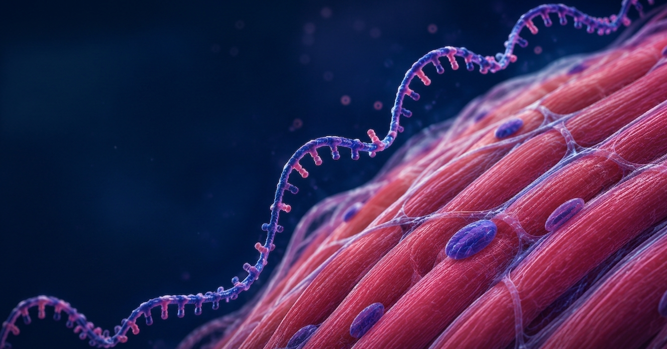
         <img src="images/muscle-cells-header.jpg" alt="Muscle Cells Background" class="hero-bg-img">
        <div class="hero-overlay"></div>
        <div class="hero-content">
            <h1>Sadkowski Lab</h1>
            <p class="hero-subtitle">
                Advancing muscle regeneration research through bioinformatics and multi-omics
                at Warsaw University of Life Sciences (SGGW)
            </p>
            <div class="hero-buttons">
    <a href="research.html" class="btn btn-primary">Our Research</a>
    <a href="about.html" class="btn btn-secondary">Learn More</a>
</div>

        </div>
    </section>

    <footer class="footer">
        <div class="container">
            <div class="footer-grid">
                <div class="footer-about">
                    <div class="footer-title">Sadkowski Lab</div>
                    <p>Advancing muscle regeneration, satellite cell biology, and bioinformatics research at the Institute of Veterinary Medicine, Warsaw University of Life Sciences (SGGW).</p>
                </div>
                <div class="footer-links">
                    <h4>Quick Links</h4>
                    <a href="about.html">About</a>
                    <a href="aim.html">Our Aim</a>
                    <a href="research.html">Research</a>
                    <a href="team.html">Team</a>
                    <a href="publications.html">Publications</a>
                    <a href="projects.html">Projects</a>
                    <a href="collaborations.html">Collaborations</a>
                    <a href="news.html">News</a>
                    <a href="contact.html">Contact</a>
                </div>
                <div class="footer-links">
                    <h4>Resources</h4>
                    <a href="https://github.com/Vahab-Gorji" target="_blank" rel="noopener">GitHub</a>
                    <a href="#">Data Downloads</a>
                    <a href="#">Software Tools</a>
                    <a href="collaborations.html">Collaborators</a>
                </div>
                <div class="footer-links">
                    <h4>Connect</h4>
                    <a href="https://github.com/Vahab-Gorji" target="_blank" rel="noopener"><i class="fab fa-github"></i> GitHub</a>
                    <a href="#"><i class="fab fa-twitter"></i> Twitter</a>
                    <a href="#"><i class="fab fa-researchgate"></i> ResearchGate</a>
                    <a href="https://scholar.google.com/citations?user=a5GopncAAAAJ&hl=en" target="_blank" rel="noopener"><i class="fas fa-graduation-cap"></i> Google Scholar</a>
                </div>
            </div>
            <div class="footer-bottom">
                <p>&copy; 2026 Sadkowski Lab — Warsaw University of Life Sciences (SGGW). All rights reserved.</p>
            </div>
        </div>
    </footer>

    <div class="lightbox" id="lightbox">
        <span class="lightbox-close" id="lightboxClose" title="Close (Esc)">&times;</span>
        <img id="lightboxImg" src="" alt="">
        <div class="lightbox-caption" id="lightboxCaption"></div>
    </div>

    <script src="script.js"></script>
</body>
</html>
/* =========================================================
   FLOATING RIGHT-SIDE SEARCH
   ========================================================= */

/* ===== FLOATING SEARCH BUTTON (right side, always visible) ===== */
.search-fab {
    position: fixed;
    top: 50%;
    right: 0;
    transform: translateY(-50%);
    z-index: 998;
    background: var(--color-accent);
    color: #fff;
    border: none;
    padding: 14px 16px;
    border-radius: 12px 0 0 12px;
    cursor: pointer;
    display: flex;
    align-items: center;
    gap: 10px;
    box-shadow: -4px 4px 16px rgba(217, 119, 87, 0.35);
    font-family: var(--font-sans);
    font-size: 0.92rem;
    font-weight: 600;
    letter-spacing: 0.04em;
    text-transform: uppercase;
    transition: all var(--transition);
    writing-mode: horizontal-tb;
}
.search-fab:hover {
    background: var(--color-accent-dark);
    padding-right: 22px;
    box-shadow: -6px 6px 20px rgba(184, 95, 63, 0.45);
}
.search-fab i {
    font-size: 1rem;
    transition: transform var(--transition);
}
.search-fab:hover i {
    transform: scale(1.15) rotate(-10deg);
}
.search-fab-label {
    font-size: 0.85rem;
}

/* ===== SLIDE-IN SEARCH PANEL (from right) ===== */
.search-panel {
    position: fixed;
    top: 0;
    right: 0;
    height: 100vh;
    width: 460px;
    max-width: 92vw;
    background: #ffffff;
    box-shadow: -16px 0 40px rgba(15, 36, 51, 0.18);
    z-index: 1100;
    transform: translateX(100%);
    transition: transform 0.4s cubic-bezier(0.4, 0, 0.2, 1);
    display: flex;
    flex-direction: column;
    overflow: hidden;
}
.search-panel.open {
    transform: translateX(0);
}

/* Panel header */
.search-panel-header {
    display: flex;
    align-items: center;
    justify-content: space-between;
    padding: 1.25rem 1.5rem;
    background: linear-gradient(135deg, var(--color-primary) 0%, var(--color-primary-light) 100%);
    color: #fff;
    border-bottom: 4px solid var(--color-accent);
    flex-shrink: 0;
}
.search-panel-header h3 {
    font-family: var(--font-display);
    color: #fff;
    font-size: 1.15rem;
    margin: 0;
    font-weight: 700;
    display: flex;
    align-items: center;
    gap: 10px;
}
.search-panel-header h3 i {
    color: var(--color-accent);
    font-size: 1rem;
}
.search-panel-close {
    background: rgba(255, 255, 255, 0.15);
    border: 1px solid rgba(255, 255, 255, 0.25);
    color: #fff;
    width: 36px;
    height: 36px;
    border-radius: 50%;
    cursor: pointer;
    display: flex;
    align-items: center;
    justify-content: center;
    transition: all var(--transition);
}
.search-panel-close:hover {
    background: var(--color-accent);
    border-color: var(--color-accent);
    transform: rotate(90deg);
}
.search-panel-close i { font-size: 0.95rem; }

/* Panel body — scrollable */
.search-panel-body {
    flex: 1;
    overflow-y: auto;
    padding: 1.75rem 1.5rem;
}

/* Pretty scrollbar inside the panel */
.search-panel-body::-webkit-scrollbar { width: 6px; }
.search-panel-body::-webkit-scrollbar-track { background: var(--color-bg-alt); }
.search-panel-body::-webkit-scrollbar-thumb {
    background: var(--color-accent);
    border-radius: 100px;
}

/* Search box inside the panel */
.search-panel .search-box {
    position: relative;
    display: flex;
    align-items: center;
    background: var(--color-bg-alt);
    border: 2px solid var(--color-border);
    border-radius: 100px;
    padding: 4px 6px 4px 18px;
    transition: all var(--transition);
    margin-bottom: 1rem;
}
.search-panel .search-box:focus-within {
    background: #fff;
    border-color: var(--color-accent);
    box-shadow: 0 0 0 4px rgba(217, 119, 87, 0.15);
}
.search-panel .search-icon {
    color: var(--color-accent);
    font-size: 1rem;
    margin-right: 10px;
    flex-shrink: 0;
}
.search-panel .search-input {
    flex: 1;
    border: none;
    background: transparent;
    outline: none;
    font-family: var(--font-serif);
    font-size: 1rem;
    color: var(--color-ink);
    padding: 10px 6px;
    min-width: 0;
}
.search-panel .search-input::placeholder {
    color: var(--color-muted);
    font-style: italic;
}
.search-panel .search-clear {
    background: var(--color-accent);
    color: #fff;
    border: none;
    width: 30px;
    height: 30px;
    border-radius: 50%;
    cursor: pointer;
    display: none;
    align-items: center;
    justify-content: center;
    flex-shrink: 0;
    transition: all var(--transition);
    font-size: 0.75rem;
}
.search-panel .search-clear:hover {
    background: var(--color-accent-dark);
    transform: rotate(90deg);
}
.search-panel .search-clear.visible { display: flex; }

/* Filters in the panel */
.search-panel .search-filters {
    display: flex;
    flex-wrap: wrap;
    gap: 6px;
    justify-content: flex-start;
    margin: 0 0 1.5rem 0;
}
.search-panel .search-filter {
    font-family: var(--font-sans);
    background: #fff;
    color: var(--color-text);
    border: 1px solid var(--color-border);
    padding: 5px 12px;
    border-radius: 100px;
    font-size: 0.78rem;
    font-weight: 500;
    cursor: pointer;
    transition: all var(--transition);
}
.search-panel .search-filter:hover {
    background: var(--color-accent-soft);
    color: var(--color-accent-dark);
    border-color: var(--color-accent);
}
.search-panel .search-filter.active {
    background: var(--color-accent);
    color: #fff;
    border-color: var(--color-accent);
}

/* Results inside the panel */
.search-panel .search-placeholder {
    text-align: center;
    color: var(--color-text-soft);
    font-family: var(--font-serif);
    font-style: italic;
    font-size: 0.95rem;
    padding: 1.5rem 0.5rem;
    line-height: 1.6;
}
.search-panel .search-placeholder i {
    color: var(--color-accent);
    margin-right: 6px;
    display: block;
    font-size: 1.6rem;
    margin-bottom: 0.6rem;
}
.search-panel .search-results-count {
    font-family: var(--font-sans);
    font-size: 0.82rem;
    color: var(--color-text-soft);
    margin-bottom: 1rem;
    padding-bottom: 0.75rem;
    border-bottom: 1px solid var(--color-border);
}
.search-panel .search-results-count strong { color: var(--color-primary); }
.search-panel .search-result-item {
    background: #fff;
    border: 1px solid var(--color-border);
    border-left: 3px solid var(--color-accent);
    border-radius: 8px;
    padding: 1rem 1.1rem;
    margin-bottom: 0.75rem;
    transition: all var(--transition);
    display: block;
    text-decoration: none;
    color: inherit;
}
.search-panel .search-result-item:hover {
    transform: translateX(-4px);
    box-shadow: var(--shadow-sm);
    border-left-color: var(--color-primary);
    border-left-width: 5px;
}
.search-panel .search-result-category {
    display: inline-block;
    font-family: var(--font-sans);
    font-size: 0.65rem;
    font-weight: 600;
    text-transform: uppercase;
    letter-spacing: 1.5px;
    color: var(--color-accent);
    background: var(--color-accent-soft);
    padding: 2px 8px;
    border-radius: 100px;
    margin-bottom: 0.5rem;
}
.search-panel .search-result-title {
    font-family: var(--font-display);
    font-size: 1rem;
    font-weight: 700;
    color: var(--color-primary);
    margin-bottom: 0.3rem;
    line-height: 1.3;
}
.search-panel .search-result-snippet {
    font-family: var(--font-serif);
    font-size: 0.85rem;
    color: var(--color-text-soft);
    line-height: 1.55;
    margin: 0;
}
.search-panel .search-result-snippet mark {
    background: var(--color-accent-soft);
    color: var(--color-accent-dark);
    padding: 1px 3px;
    border-radius: 2px;
    font-weight: 600;
}

.search-panel .search-no-results {
    text-align: center;
    padding: 2rem 1rem;
    color: var(--color-text-soft);
}
.search-panel .search-no-results i {
    font-size: 2.4rem;
    color: var(--color-border);
    margin-bottom: 0.75rem;
    display: block;
}
.search-panel .search-no-results h3 {
    color: var(--color-primary);
    margin-bottom: 0.4rem;
    font-size: 1.05rem;
}
.search-panel .search-no-results p {
    font-style: italic;
    font-family: var(--font-serif);
    font-size: 0.9rem;
}

/* Popular topics in panel */
.search-panel .search-suggestions {
    margin-top: 1.5rem;
    padding-top: 1.25rem;
    border-top: 1px solid var(--color-border);
}
.search-panel .search-suggestions h3 {
    font-family: var(--font-display);
    font-size: 0.95rem;
    color: var(--color-primary);
    margin-bottom: 0.75rem;
    font-weight: 600;
    text-align: center;
}
.search-panel .suggestion-tags {
    display: flex;
    flex-wrap: wrap;
    gap: 6px;
    justify-content: center;
}
.search-panel .suggestion-tag {
    display: inline-flex;
    align-items: center;
    gap: 4px;
    font-family: var(--font-sans);
    font-size: 0.78rem;
    color: var(--color-primary);
    background: var(--color-bg-alt);
    border: 1px solid var(--color-border);
    padding: 5px 11px;
    border-radius: 100px;
    text-decoration: none;
    transition: all var(--transition);
}
.search-panel .suggestion-tag::before {
    content: '#';
    color: var(--color-accent);
    font-weight: 700;
}
.search-panel .suggestion-tag:hover {
    background: var(--color-accent);
    color: #fff;
    border-color: var(--color-accent);
}
.search-panel .suggestion-tag:hover::before { color: #fff; }

.search-panel .search-suggestions.hidden { display: none; }

/* ===== BACKDROP ===== */
.search-panel-backdrop {
    position: fixed;
    inset: 0;
    background: rgba(15, 36, 51, 0.55);
    backdrop-filter: blur(4px);
    -webkit-backdrop-filter: blur(4px);
    z-index: 1099;
    opacity: 0;
    visibility: hidden;
    transition: all var(--transition);
}
.search-panel-backdrop.visible {
    opacity: 1;
    visibility: visible;
}

/* Hide body scrollbar when panel is open */
body.search-open {
    overflow: hidden;
}

/* ===== MOBILE RESPONSIVE ===== */
@media (max-width: 768px) {
    .search-fab {
        padding: 12px 14px;
        border-radius: 10px 0 0 10px;
    }
    .search-fab-label {
        display: none;          /* show only icon on mobile */
    }
    .search-fab i { font-size: 1.1rem; }

    .search-panel {
        width: 100%;
        max-width: 100%;
    }
    .search-panel-header { padding: 1rem 1.25rem; }
    .search-panel-body { padding: 1.25rem 1rem; }
}
/* Highlighted nav item (Research, pinned far right) */
.nav-link-highlight {
    margin-left: 8px;
    background: var(--color-accent);
    color: #fff !important;
    border-radius: var(--radius-sm);
    padding: 7px 16px;
}
.nav-link-highlight::after { display: none !important; } /* no underline */
.nav-link-highlight:hover {
    background: var(--color-accent-dark);
    color: #fff !important;
    transform: translateY(-1px);
    box-shadow: var(--shadow-warm);
}
/* =========================================================
   HEADER SEARCH BAR — pinned to the RIGHT (after Contact)
   ========================================================= */
.header-search {
    display: flex;
    align-items: center;
    background: var(--color-bg-alt);
    border: 1px solid var(--color-border);
    border-radius: 100px;
    padding: 4px 4px 4px 14px;
    margin-left: 12px;
    flex-shrink: 0;
    transition: all var(--transition);
}
.header-search:focus-within {
    border-color: var(--color-accent);
    background: #fff;
    box-shadow: 0 0 0 3px rgba(217, 119, 87, 0.15);
}
.header-search-input {
    border: none;
    background: transparent;
    outline: none;
    font-family: var(--font-sans);
    font-size: 0.85rem;
    color: var(--color-ink);
    width: 160px;
    padding: 4px 0;
}
.header-search-input::placeholder {
    color: var(--color-muted);
    font-style: italic;
}
.header-search-btn {
    width: 30px;
    height: 30px;
    border-radius: 50%;
    border: none;
    background: var(--color-accent);
    color: #fff;
    cursor: pointer;
    display: inline-flex;
    align-items: center;
    justify-content: center;
    font-size: 0.8rem;
    transition: all var(--transition);
    flex-shrink: 0;
}
.header-search-btn:hover {
    background: var(--color-accent-dark);
    transform: scale(1.05);
}

/* Hide on tablets/mobile — floating search-fab takes over */
@media (max-width: 1100px) {
    .header-search { display: none; }
}
/* =========================================================
   HEADER SEARCH BAR — visible on ALL pages, pinned RIGHT
   ========================================================= */
.header-search {
    display: flex;
    align-items: center;
    background: var(--color-bg-alt);
    border: 1px solid var(--color-border);
    border-radius: 100px;
    padding: 4px 4px 4px 14px;
    margin-left: 12px;
    flex-shrink: 0;
    transition: all var(--transition);
}
.header-search:focus-within {
    border-color: var(--color-accent);
    background: #fff;
    box-shadow: 0 0 0 3px rgba(217, 119, 87, 0.15);
}
.header-search-input {
    border: none;
    background: transparent;
    outline: none;
    font-family: var(--font-sans);
    font-size: 0.85rem;
    color: var(--color-ink);
    width: 160px;
    padding: 4px 0;
}
.header-search-input::placeholder {
    color: var(--color-muted);
    font-style: italic;
}
.header-search-btn {
    width: 30px;
    height: 30px;
    border-radius: 50%;
    border: none;
    background: var(--color-accent);
    color: #fff;
    cursor: pointer;
    display: inline-flex;
    align-items: center;
    justify-content: center;
    font-size: 0.8rem;
    transition: all var(--transition);
    flex-shrink: 0;
}
.header-search-btn:hover {
    background: var(--color-accent-dark);
    transform: scale(1.05);
}

/* Hide on tablets/mobile — the floating search-fab takes over */
@media (max-width: 1100px) {
    .header-search { display: none; }
}
/* =========================================================
   HEADER SEARCH BAR — visible on ALL pages, pinned RIGHT
   ========================================================= */
.header-search {
    display: flex;
    align-items: center;
    background: var(--color-bg-alt);
    border: 1px solid var(--color-border);
    border-radius: 100px;
    padding: 4px 4px 4px 14px;
    margin-left: 12px;
    flex-shrink: 0;
    transition: all var(--transition);
}
.header-search:focus-within {
    border-color: var(--color-accent);
    background: #fff;
    box-shadow: 0 0 0 3px rgba(217, 119, 87, 0.15);
}
.header-search-input {
    border: none;
    background: transparent;
    outline: none;
    font-family: var(--font-sans);
    font-size: 0.85rem;
    color: var(--color-ink);
    width: 160px;
    padding: 4px 0;
}
.header-search-input::placeholder {
    color: var(--color-muted);
    font-style: italic;
}
.header-search-btn {
    width: 30px;
    height: 30px;
    border-radius: 50%;
    border: none;
    background: var(--color-accent);
    color: #fff;
    cursor: pointer;
    display: inline-flex;
    align-items: center;
    justify-content: center;
    font-size: 0.8rem;
    transition: all var(--transition);
    flex-shrink: 0;
}
.header-search-btn:hover {
    background: var(--color-accent-dark);
    transform: scale(1.05);
}

/* Hide on tablets/mobile — the floating search-fab takes over */
@media (max-width: 1100px) {
    .header-search { display: none; }
}
/* ============================================
   PUBLICATIONS PAGE — Sub-headings & Recent Card
   ============================================ */

/* Small section heading inside publications list */
.pub-subheading {
    font-family: 'Merriweather', serif;
    font-size: 1.15rem;
    font-weight: 700;
    color: #2c3e50;
    margin: 1.8rem 0 1rem;
    padding-bottom: 0.4rem;
    border-bottom: 2px solid #c0392b;
    display: inline-block;
    letter-spacing: 0.5px;
}

/* First sub-heading: no extra top margin */
.publications-list .pub-subheading:first-child {
    margin-top: 0;
}

/* Highlight the recent publication card */
.pub-item.recent {
    background-color: #fff8f0;
    border-left: 4px solid #c0392b;
    padding: 1rem 1.25rem;
    border-radius: 6px;
    margin-bottom: 1.5rem;
    box-shadow: 0 2px 6px rgba(0,0,0,0.05);
}
/* ============================================
   FOOTER — Webmaster Credit
   ============================================ */
.footer-bottom .webmaster {
    margin-top: 0.5rem;
    font-size: 0.9rem;
    color: #cfd8dc;
    letter-spacing: 0.3px;
}

.footer-bottom .webmaster i {
    margin-right: 6px;
    color: #c0392b;
}

.footer-bottom .webmaster a {
    color: #ffffff;
    text-decoration: none;
    transition: color 0.2s ease-in-out;
}

.footer-bottom .webmaster a:hover {
    color: #c0392b;
    text-decoration: underline;
}
